torsdag 14 november 2013

Zodiac clock

I found an old assignment for my art class back in 2011 and I want to show you the process of how I did it. And yes Fabbe, I know that my English and posts are hilarious. 

For the assignment we had to draw three pictures, two small and one big. And we also had to make something 3dimensional and a print. Everything with the same theme. I chose the zodiac; scorpio as my theme and in this post I will show you the larger picture out of the three that I did.

At the time I had my mind set on steampunk basically all the time, so I decided to make a big chart of the zodiac with the influence of steampunk. 
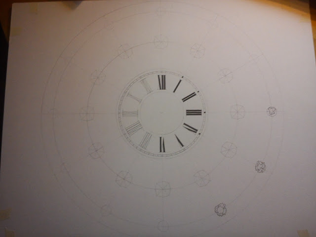
And when I thought big, I kind of thought too big I think. So I made a circle with about 40 cm in diameter. After that I divided the circle into 12 parts, like a big pizza. Then I had to come up with something to divide all those parts from each other. So I started with some basic sketches of how I wanted it look. I was kind of thinking blue fluids, rust and cogwheels.

 At this point I had come to the understanding that I wanted it to look like a clock. I wanted to show the symbols and the actual characters for the star signs and I wanted their names there as well. So that left me with 12x3 areas to fill. 

Here I have all the symbols ready for tracing. 


(No offense) except for Fabbe.

the signs are all done and I'm working on some detail work. 

Until this point I skipped taking pictures. I've added the characters for the signs, the names and the dividers. I've painted everything except for the characters, the watch and the background.
I even have a video from when I painted one of the dividers which you can find here:


And the outcome! While I was at it I made it in to an actual clock, and it works (duh)
Everything is detailed with bolts and the pointers are wired in gold wire. I think that the blue fluid kind of gives of a feeling of life in all that rusty brown non-living feeling. I really like it.
Right now it's hanging on display in my grandparents house for old people to watch, I guess.
Anyhow, my teacher told me that I kind of overdid the assignment and it took FOREVER to make...But hey, I got the highest grade and that's always something :D



tisdag 17 september 2013

Thunder

Here I go again, comparing pictures I've taken in Japan during the sumer. 

I had one of my "moments" and felt that I needed to go out on the balcony for a while, and hell it was lucky I did!! The weather was warm, I could see stars right above me tough it was cloudy in the south. And just as I stand there leaning on the fence, I see something lit up amongst the clouds, I look a bit closer and yes! There's a fuck*ng thunderstorm going on over there. 

So I get all excited, I mean wow it was so beautiful! I ran to my room, making people all confused and ran back there again. Boy I was determined to catch that with my camera.

I mean just look at this. It might not be the greatest lightning-pic ever, bit I definitely think it has some kind of charm.  
Even though I love the pic it turned out a bit shaky since I did it free-handed, but it looks cool anyway. The colors are a bit dull and I really wanted to remove the shaky foreground.


Here we go. All edited and nice.
The foreground is gone, it's darker and I added these really awesome pink colors. It's alive!
The beutiful transition from pink to orange is just perfect. I can't tell you guys how proud I actually am of this picture.


söndag 15 september 2013

Howl's Moving castle fanart - tutorial

I've been working on this picture for a very long time now! But today I thought it was time to finish it.
I will show you it as an tutorial in case you want to try something similar yourselves.

Here, have some music from the movie to go with the picture.
http://www.youtube.com/watch?v=HMGetv40FkI

1. First off, have an idea. You won't get very far without one. Just let your imagination flow. I had this picture with Howl from Howl's moving castle in my head. Him standing in the middle surrounded by bright colors and just looking magical.
So I started to do a light sketch of how I wanted him to look (left drawing). It doesn't have to be perfect at all, it's just a sketch!
When I thought I got the right pose for him I started to work on the actual size Howl (right drawing) that I wanted in the center of my drawing.
I fixed his jacket, hair, legs etc. and I even added Calcifer (the fire).


2. When I was satisfied with his look I traced him over to the center of a aquarelle-paper with the help of a light table.


3. None of this was planned at all. I just thought it would be nice with some diamonds since Howl has them on his jacket. But then it looked so empty between him and the diamonds so I started adding some other characters from the movie, just the same way I did with Howl.


4. After adding all of the characters and all of the diamonds I filled all the lines with a black 0.05 marker. I like my lines thin. I used an eraser and erased all the leftovers from my pencil. (make sure that the marker has dried before you start to erase or it will smudge).
Then it was time to start with the background. I wanted to go all crazy with my background without having to think about smudging it over to my characters or diamonds. So I just covered the areas that I wanted to stay white with liquid masking film. 

5. I took one of my larger brushes, a number 8, da vinci-cosmotop-nova. I got some sea salt and regular salt from the kitchen and I started going wild with my colors.


6. I take color after color and smudge them into each other to make these beautiful transitions. I also use a lot of water so that i easily can work with them without any problems. I also pour some salt on it here and there to make some really cool effects.  


7. There we have it! It looks really messy right now, but that will be fixed after we remove the liquid masking film.

8. See the difference? I think it turned out beautiful!
You basically just peel the masking fluid with your fingers and nails when the color has dried and you get these awesome white areas left. 

9. After this I started working on the characters. I love working with shadows. I think it adds such a nice effect and texture to the painting.

10. I just keep painting them one after another.


11. After painting the characters I felt that I didn't want to leave the diamonds all white. So I tried some different patterns and such, but it just didn't look right, so I made half of the diamonds all black. It looks pretty neat and it gives a very dramatic effect.

I hope you enjoyed this tutorial and that you got lots of inspiration.
Remember everything can't turn out perfect every-time. I even have some things that I would like to change about this picture, but there's not much to do about that now. 

söndag 8 september 2013

Clouds

This beautiful piece goes so well with the picture that I'm almost starting to cry of happiness.
http://www.youtube.com/watch?v=MccmHwA-c4U
This can also be of nostalgic reasons though..

This my friends, is a lovely cloud. I somehow started to grow some kind of love to clouds while I was in Japan. I got so exited when I saw this, so I have about 30 pictures of only this cloud. We were on a bus on our way to Mino city if I remember correctly. Maybe it doesn't look as exciting and amazing as I thought at the moment.

So yeah, I thought I had to do something with it. I didn't like the sharp edge the mountains gave, so I smoothed that out to give a cool effect. Actually I just went all crazy and gave it this light is fighting darkness role. I think it turned out pretty cool. It's like in the movie; The nothing is coming...


Gifu at dawn

A song to give you the right feelings for the picture
http://www.youtube.com/watch?v=K4pwdw3_Azc
A Japanese song for a Japanese landscape.


When I took this picture we were on our way to watch fireflies. I was so stunned because we never have these beautiful skies in Sweden. I remember it was so breathtaking. Looking at the picture now I go all "meh". I think I've seen too many beautiful skies in Japan to actually be impressed anymore. I think it miss color and looks a bit plain.


So I gave a feeling of mystery to it with my old friend PS. I darkened it a lot since I wanted to give a bigger contrast to the mountains in the background and I also added some color. It feels so much more alive right now.

But then I was like "It needs more color, god dammit!" and it went all pink. I prefer this picture because it feels warm an welcoming. Since the picture is pink I kind of get this romantic sense from it, just stabbing me right in the heart. This is definitely a place you would want to bring your valentine *hint*

Bamboo

I think I'll link the music first so you actually can listen to it while you read my texts.
http://www.youtube.com/watch?v=dTIq5lm3Bi0
It's silly how they just conveniently sings about bamboo.
I'll just continue compare edited and unedited pictures.


 So, we came to Japan (FINALLY), Gifu to be exact. And we just happened to have a bamboo forest outside our corridor. But just look at how plain that shit is. I was expecting green, green and more green, as you can see in all the pretty pictures on the net. I want it to glow!


And here is my savior, PS. So now I just have to erase that other picture out of my head. I gave the forest life. By adding all that green the forest seem so much healthier. It's a pleasure to the eye. I can recall a test I saw on tv once. They put one bowl of plain looking candy and one with the same candy just with funny colors. They tasted exactly the same, but no one ate from the plain ones.
So, which forest would you go into?

lördag 7 september 2013

The view from a plane

I went to Japan this summer, an unforgettable experience. While I spent my time there I took some pretty nice shots, so I thought I should show them to you before I edit them and after.
I'm not a professional, I just kind of go with the flow. 

Here I have a shot from the airplane on our way from Copenhagen to Helsinki. It's a bit plane *badumts* (okay that sucked, sorry) The colors are quite vague and it has it's flaws in the edges. It also has a disturbing little cloud in the middle of it. I mean, why go with the flow when you can be hipster? Stupid cloud.


And here we have it, the edited one. The hipster cloud is gone. I removed the ugly edges. It has this really beautiful transition of blue colors (I'm almost peeing myself of excitement over here)
The turquoise glow from the clouds is just making the image magical. The dark contrasts to the light is just making me go *waaaow*
I can really feel the roundness of the planet. I hope that does not sound too weird.

Here, have some matching music while it's still warm;
http://www.youtube.com/watch?v=Y1L8uRApYeQ

Colorful space shoes

Hey guys! So this is my first submit here and I hope that you will find it pretty, wonderful and whatsoever. I got a pair of white shoes from my sister since she didn't fit them, and I thought that I wanted to do something fun with them to make them look less plain. I decided to go for a space theme, but instead of doing the old black-purple-blue theme, I went crazy with all kinds of colors to take advantage of all the whiteness.


1. First of all you need a pair of white shoes. These are actually like Dr.Martins, except for the fact that they are fake. They have kind of a shiny surface which I thought was perfect to work with. Fabric-shoes can be a bit difficult to work with when doing this, but hey, if that's what you got why not give it a try?


2. Remove the shoelaces and prepare everything that's needed.
*A flat surface where you can mix your colors. I just used a red candle-tray that I found in my garage.
*
Colors. I use acrylic colors. I wanted to go with a really bright colorful theme so I am using everything from pink, yellow, green, blue, black, red and so forth.
*You will also need brushes and some kind of sponge. I just took some old brushes that I found. It's not really important if they are cheap or expensive or how they look. As long as they work for you. For the sponge I took some kind of cleaning sponge, cut of the green part and then cut it into smaller pieces. You can see them hiding behind the shoes. The texture of the sponge is a bit smoother
*Some kind of clear varnish, to help the paint stay fresh and protect it from water and so on.


3. Then you go crazy with your sponge. Just take a bit of color and start to apply it on the shoe. Take another color and mix it into the other one to make a smooth transmission. I chose to go down on the sole a bit and even add some black spots to make the contrasts even bigger. And eventually your shoes will look something like this. You can if you want to, add some cool details with a brush.

4. Now it's time to go all STAR over these beauties. So first of all, I took some white paint and mixed it with some water, took a harder brush and dipped it into the color. Then I used my finger and bent the straws against me and let go. Kind of like how you do when you want to shoot food at someone with a spoon. And by doing that all over the shoe I got small small dots all over. If you want to you can just let it be like that. I chose to make it even starier. So I took a small brush and made a bit bigger dots everywhere until I was happy with it. I even added some details with gold and silver. When it's completely dry you coat the entire shoe with clear varnish. And Voilá.


Here you have some music to go with them;
http://www.youtube.com/watch?v=JKQwgpaLR6o